The Value of Color
I hate titling these. I feel like they come out sounding too self-serious, so I try to deflate that with a self-deprecating subtitle, and anyway my apologies if you read to the end of this sentence.
I’ve been trying something new lately.
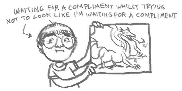
I grew up believing the best art was realistic art, and the best way to render it was with as much detail as possible. I internalized the compliment so often paid by people to drawings and paintings they admired:
Every image I made as a kid was just another opportunity to prove I was a Good Art Boy who could make a thing look like it looked.
That, plus being a giant nerd, positioned me to get freelance work making fantasy art for games like D&D and Magic: the Gathering in early adulthood.
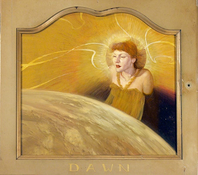
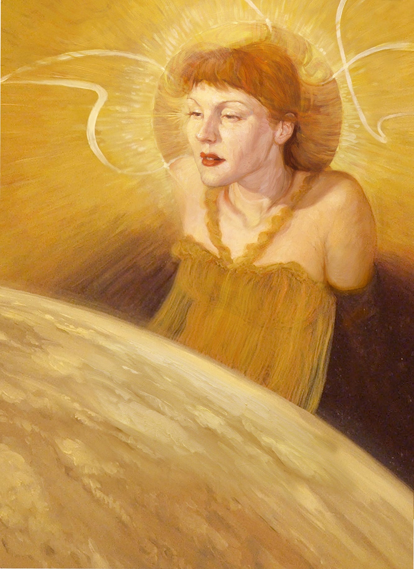
This is not that. This is a painting of my wife as the sort of pretty-lady-personification thing the Victorians liked so much.
But it represents a certain type of oil painting I sometimes do, a type well-suited to fantasy art.
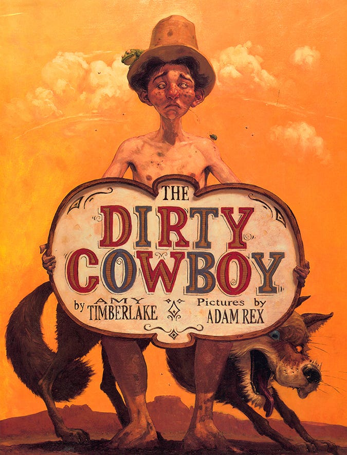
When the time came to paint my first picture book (The Dirty Cowboy by Amy Timberlake, 2003), I rendered it in a similar way, albeit with more stylized characters.
Funny thing was, as a fantasy artist my work was often described as “loose.” “Impressionistic.” And now I was the uptight prissy fusspot of children’s literature.
As proud as I remain of The Dirty Cowboy, it doesn’t look much like the children’s book illustration I love best. Stuff by people like Isabelle Arsenault and Matthew Forsythe. The arc of my career has been toward trying to make pictures that are more expressive and messy and shot through with little surprises. All while fighting my urge to be a Good Art Boy who can make a thing look like it looks.
Anyway, This Is the New Thing I’ve Been Trying Lately
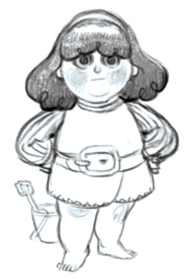
As always, an illustration starts with a sketch. This is a detail from the book I’m working on.
I love this kid.
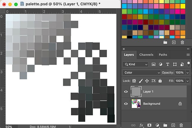
I want to force myself to make color choices I wouldn’t naturally make, so I worked up this little palette on the left to sample from:
Adam, I can hear you saying, those are a bunch of grayscale squares. Well spotted. And they are until I turn off that gray layer on the right, which is set to modify the color of the layer that contains the actual squares. This is what it really looks like:
The values of colors—that is, their lightness or darkness—can surprise you. Look at these rectangles.
If you experience them like I do, you find the rust color just slightly lighter than the purple, but about the same value as the green. You think the magenta on the left is brighter than all of them. But if you convert this image to grayscale…
It all looks roughly the same.
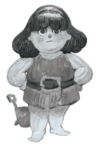
So: when the gray layer is turned on, I have a palette of colors, arranged from light to dark, the true hues of which I don’t allow myself to see.
(There’s maybe a more elegant way to do all this, but this is the method I’ve cobbled together)
I then set about painting a rough study of my kid in “black and white.”
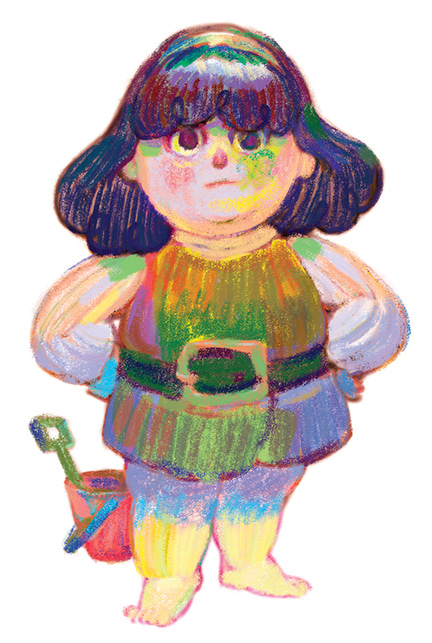
And now comes the moment that’s got me excited about digital painting again—I get to switch off the gray and see what I’ve actually done:
Is it weird that I kind of love this? That I almost want to make a book that just looks like this? I never will, of course, because then how would I prove I’m a Good Art Boy who can make a thing look like it looks.
Anyway—after I paint the garish version above, I paint over it (with an intentionally imprecise brush), trying my best not to entirely cover all those weird colors up.
Did I just ruin it? Did I rescue it? Is none of this a good idea? Maybe you’ll tell me what you think in the comments below.
Braggadocio Corner
Last month I went on for a bit about how my chapter book, The Story of Gumluck the Wizard, has earned five “Starred Reviews” from various reviewers. So this month I’m not going to do that, and I don’t even know why I brought it up. I do want to tell you though that it’s been named the following things:
You might even say this means you have fewer and fewer reasons not to get a copy. Beats me, I’d never put it that way personally.





Yes to experimenting while hoping to knock some traditional rendering in its pants. It’s hard. I try to set up things like you did where things get messy and uncomfortable and random. It’s good stuff. 💪
As a reforming good art boy (and graphic designer) myself, I especially like the surprise of revealing the colors - the same way I like the intentionally imprecise brush. I've always loved your work - but, even more-so now!